I love a great color combo that catches my eye. I googled ‘retro color combos’ and came up with this:
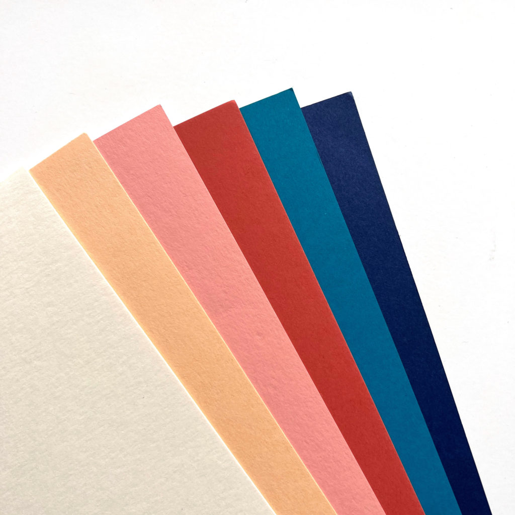
- Bazzill Butter Mints
- Stampin’ Up Pale Papaya
- Stampin’ Up Crisp Cantaloupe
- Stampin’ Up Dusty Durango
- Stampin’ Up Island Indigo
- Stampin’ Up Night of Navy
In case you didn’t know, Stampin’ Up was the first manufacturer that really pushed me into crafting. Are you a Splitcoaststamper member? Check out my old gallery HERE. I’m still a fan and have a ton of their cardstock.
Here’s how that retro color palette inspired me:
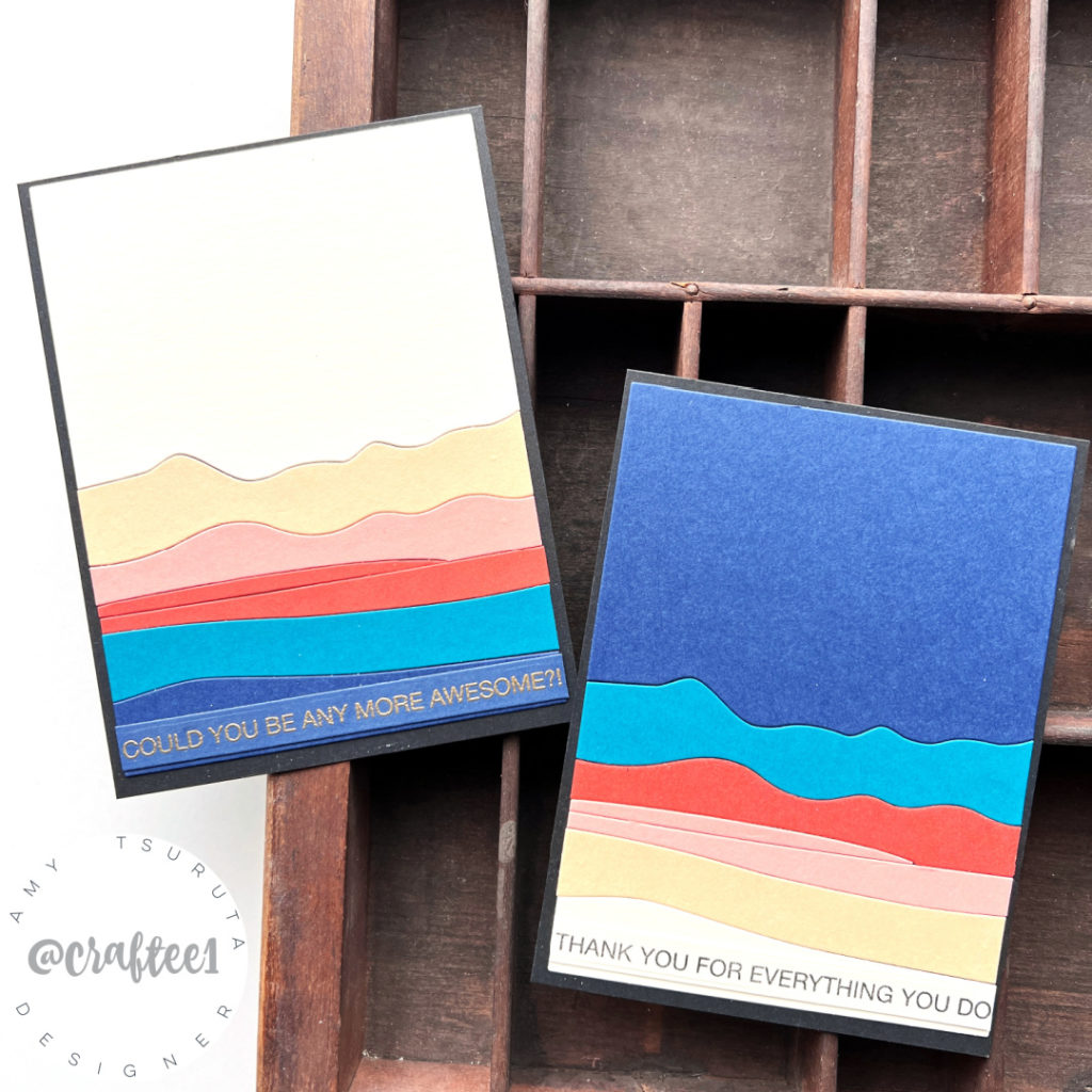
I’m featuring the Ellen Hutson – Essentials by Ellen – Abstract Sunset Designer Die. I couldn’t decide if I liked the lighter or the darker colors on top, what about you?
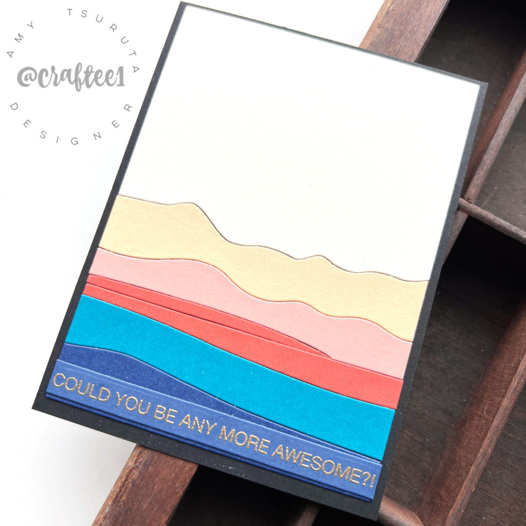
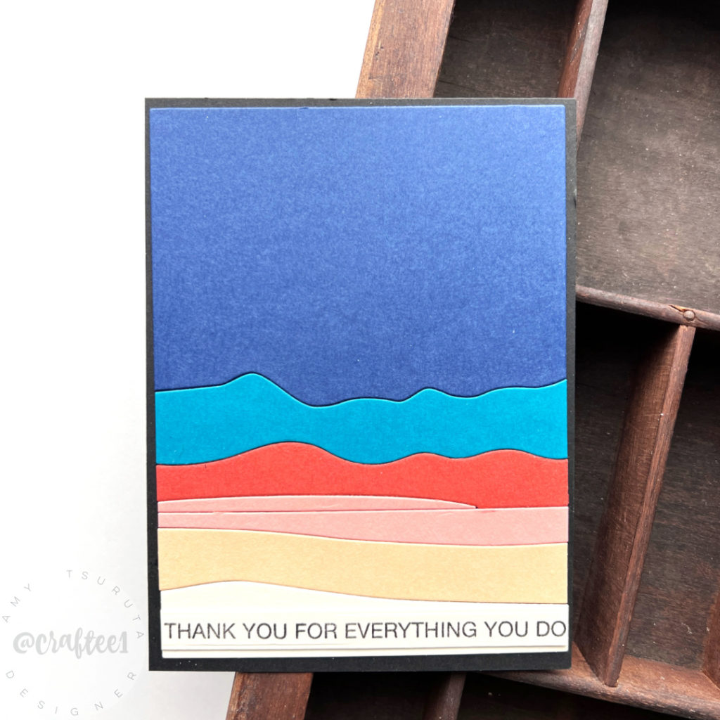
I like the lighter to darker more because that’s typically how I stack colors on a project. I don’t do a bunch of Distress Oxide ink blending so if I did, maybe I’d look at it differently?
The sentiments are from the Nice of You set. I couldn’t bear to stamp the sentiment in the upper portion because I, of course, already adhered everything down. sigh.
Totally a self challenge design. You know I love a great photo or sketch challenge….
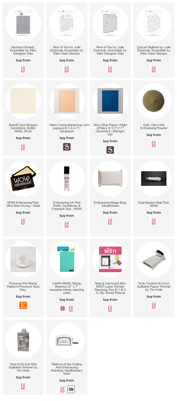
Some links are affiliate a no extra cost to you:
