

I’m so excited to be joining The Ton and their design team to celebrate their 3rd Anniversary! You should have arrived here from The Ton!
Giveaway information: Effie is giving away a stamp set of choice to a lucky commenter. To qualify, you must leave a comment on each blog stop for the respective giveaway day for which you are entering. The comment period for all giveaways closes on January 28, 5pm EST.
In case you missed it, the hop runs for a week starting Friday, January 19th:
Jan 21st
I have two cards to share with you today so let’s get started! The first one features:
City Buildings Cling Background
Seriously Amazing Sentiments


I have two cards to share with you today so let’s get started! The first one features:
City Buildings Cling Background
Seriously Amazing Sentiments

I was definitely encouraging my inner Tim Holtz on this one. I tend to be a clean and crisp designer but knew that I wanted the City Buildings to be more grungy teamed up with the ultra awesome Seriously Amazing Sentiments. Both have been stamped with Distress Oxide Black Soot. I used a sheet of paper from the Pinkfresh Studio Boys Fort collection, which was already distressed looking. I’m going to squirrel this one away for my boy who heads back to NYC this week.
Next up is a card that features the Kind, Fierce and Brave Mini set:
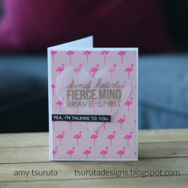
I teamed up the sentiment with The Ton’s Flamingo Print cling background. I love how this one turned out. I’ve been pretty smitten with the pale pink + hot pink color combo. The sentiment has been heat embossed in gold on a vellum heart.
That’s it for me, I can’t wait to see how Mayline Jung was inspired…she’s your next blog!
In case you get lost along the way, here’s today’s hop listing:
January 22
Amy Tsuruta 💗
Thanks so much for stoppin’ by!
Please follow and like us:
60 thoughts on “The Ton’s 3rd Anniversary Release Blog Hop 1/22”
Love your stamps and love these background stamps!!
Love how you did your backgrounds
These are gorgeous! LOVING the Flamingos!!!!!!!!!!1
Great cards, I absolutely love the pink flamingos, love the vellum heart!
I love the way you used the buildings as a background!!!
Wonderful cards! The cityscape is fabulous!
Fabulous cards!
Awesome cards….love that grunge look!
Wow, the cityscape card is sooooo beautiful! Love the distressed look on this one. Pure perfection! I love those pink flamingos also!
Love the backgrounds on both of these cards.
Great cards! Love the City Buildings background!
I love those flamingos and the city buildings.
Very nice cards, Amy! I love the first one with the city scape background!!
Both your cards have wonderful bgs ! Loved them.
Great cards!
Both of your cards are amazing. I love the vellum sentiment heart over the flamingo background… so pretty. And you aced the grunge look on your first card. Creating such diverse looks certainly signifies channeling your inner talents! TFS.
Great cards. Love the pink combination.
The background of your City Buildings is amazing! Those sentiment really are "seriously amazing"!
Way to change it up… the building stamp looks so good grunged up and distressed. Awesome masculine card, Amy.
Great job with the City Buildings card – it looks good grunged up!
No Amy these cards are amazing! 😉
these cards are so lovely esp the first one – very inspiring:)
The flamingos card is really lovely !
[margessw(at)icloud(dot)com]
The City Buildings stamp is really awesome! I love
how big it is. And your card using it is 'amazing'. 🙂
Those flamingos are my fave, tho, being a Florida girl.
We love our Flamingos. 🙂 Sweet card!
Very pretty. Love how you colored the city background. Thanks for sharing
Love the background
stamping on the first
card, looks neat. Lovely
second card.
Carla from Utah
I love how your city scape background turned out, really awesome.
Love both of your cards beautiful
Such gorgeous cards. Thanks so much for sharing…
Love the Tim Holtz inspired card!
love your grungy city!
These are really cool, I especially like the city buildings card – the background is fab!
Great card!!! Love so much your flamingos!!!
Those flamingos are awesome! I really like your cards, completely different color schemes that show off your versatility!
LOVE that city background! So cool and love that you grunged it up… and of course those flamingos with that awesome sentiment..
I love the details of that city background and the great grungy look you gave it! Fantastic sentiment on that second card, and so fun with the flamingos!
this looks like the perfect foggy day in a neighborhood I'd love to live in, amy …fabulous!
=]
Such beautiful cards Amy! I love the city background. The flamingoes are lovely.
Oooh! I hadn't notices the 'yea, I'm talking to you' sentiment before… Love it paired with your sweet card! I also love the smoggy look of your city!!
I really like that grunge look. Great job!
Two very different looks on these cards, but you are rockin' both of them! Love the grunge look, but also love the pretty pink flamingoes. Great job!
Great cards! Love the City Buildings.
Both cards are unique and gorgeous!
Love the cityscape.
It has a vintage feel to it.
The heart and flamingos is
a fun card.
thanks for sharing.
txmlhl(at)yahoo(dot)com
Nice Card designs great new products
Love the sentiments!
Love your city buildings card! 🙂 Great work!
I've seen so many of the florals, I really appreciate seeing some of the other stamps in action. That buildings one is really cool. Thanks so much for sharing!
very nice cards!
cute cards!
Those flamingos are just so fun!
Super cute 🙂 Thank you for the inspiration!
Fantastic cards! I love you building background in the first card!
Gorgeous cards!
Awesome cards!!
I love the background on your first card.
The color combination of the flamingo card is just magical. Thank you so much.
WOW, these two are awesome cards, Amy. Great city-scape background, but my Florida lovin' heart really 'needs' that Flamingo stamp 😉
Such beautiful background for your lovely cards Amy! Very inspiring 🙂
The sayings and background stamps are must haves!! Great Cards!
Comments are closed.