post 2 of 2 for today…click here for my Snowman Shaker Card!
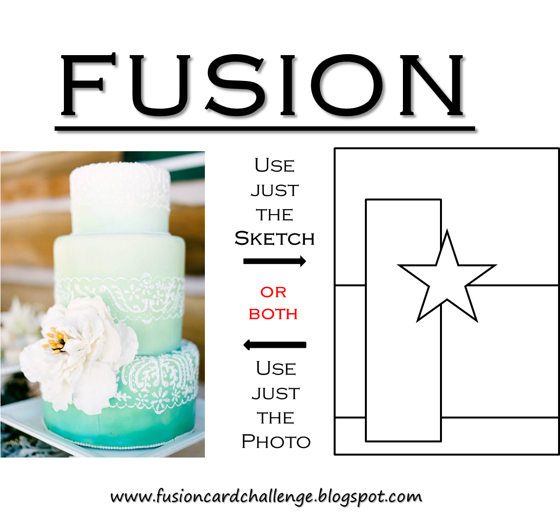
The new Fusion Card Challenge has posted!
Isn’t it fun?!!!
This week I decided to focus on the photo inspiration:
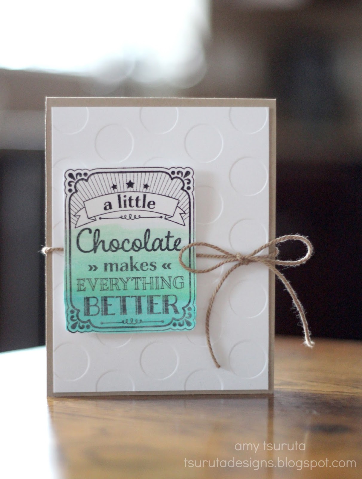
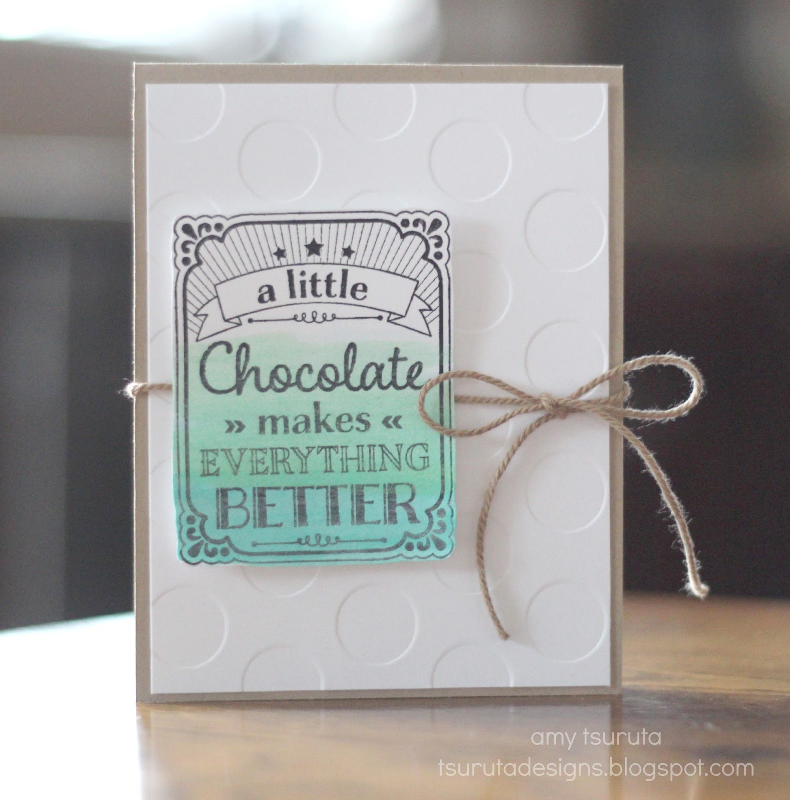
cardstock: papertrey ink stamps: hero arts/a litte ink: staz on black, watercolors other: stampin’ up embossing folder & twine
I love the Hero Arts A Little stamp set. It has that great shape and a ton of words to pop in there.
Coffee is my favorite word but for today’s card I went with Chocolate.
I did a few swooshes of color and kept the overall design clean & crisp!
Make sure you check out my teamies!


34 thoughts on “Fusion: A little chocolate…”
Isn't this the set that has bacon in the option list? Fabulous card. Love the pop of aqua, perfect for the inspiration.
Love the white embossed panel, and the sentiment is totally true!
Well, chocolate comes from a bean too, right?! You're close to coffee here! Really cute ombre sentiment … great idea from the photo.
Love the ombré on the sentiment 🙂 and those embossed bold dots are so amazing !
Oooh, LOVE this! Simply, perfect!
Just lovely my friend!!
Deanne 🙂
Could not agree more, love the background with the big embossed circles!
Oh, wow, this is fabulous, Amy! I love it!
This is so pretty! I love that SU embossing folder! I like both coffee and chocolate so I combine my coffee with my chocolate and drink it! I consider it having my cake and eating it too! 🙂
How about chocolate, coffee, diet coke? They all make life better! Love your card Amy.
This is so cute! I love the gradient on the sentiment panel and the awesome de-embossing, is that what it's called? I'm out of the loop.
So pretty! Love the ombre effect!
Love your ombre on your sentiment panel Amy – I AM a little shocked that we are talking about chocolate and NOT coffee??!!! LOL!
Love this!
Oh amy, this is scrumptious… and the debossed dots? Fabulous!! Source please?
=] Michele
Love your chocolate card, Amy, I could use some right now! On my endangered species list! Love this but your coffee cards are the best as well. Hope your Thursday was a good one!
Gorgeous! I loveeeeeeee the colors and that sentiment is pure fact! 🙂
This is such a GREAT card Amy!
LOVE the stamp and the colors!!!
So pretty! Love the color gradation!
Sweet! I adore that sentiment too! and the lovely ombre, and BUG GINORMOUS Dots!! Yay!
ohhh love the soft blue ombre on here!!
What a super fun set and card!
So pretty, Amy!
So pretty! Love the big dots. And LOVE the color wash!
love, love, loving this theme at FUSION! and your card is such an awesome take on the ombre!!! it's kind of a very CAS version of the sketch, too, actually; the twine is kind of a narrow version of the horizontal strip and the bow swaps out for the star shape! you are SO CLEVER, missus! <3
You certainly rock these inspiration photos!! I love your ombre colouring, its wonderful with the white and kraft. And I agree with the sentiment completely!!
Sweet sweet I love the chocolate…
Lovely
Bacioni
Amy, the ombre sentiment panel is perfect! As is that string! Beautiful CAS design. 🙂
LOVE it! The embossing pops, and so does the ombre!
Love this sentiment! In fact, I think a little should be changed to a LOT! Hee! Hee!
Love the card!
Polka dots, ombre sponging and that oh-so-true sentiment…a winning combination in my books!
Hugs~c
I've probably said this a thousand times, but I love your style. The ombre swipes of ink to bring focus to your darling sentiment is so pretty against the clean crisp embossed white background with touches of tan to soften it. Lovely!
Thought icommented on this, but didn't? I don't even know anymore, but I LoVe this card, great colors and design!
Beautiful card & the sentiment is so true! Coffee works as well 🙂
Comments are closed.