
Hello & Happy National Scrapbooking Day!
In case you missed it from yesterday, I was up on the Sweet Stamp Shop Blog. I’ve been featuring 1 stamp set – 2 ways.
This time around I was super pleased with the results!
The set?
So I’ve always gravitated to sentiment sets and have, like everyone else, had a fascination with the handwritten look:
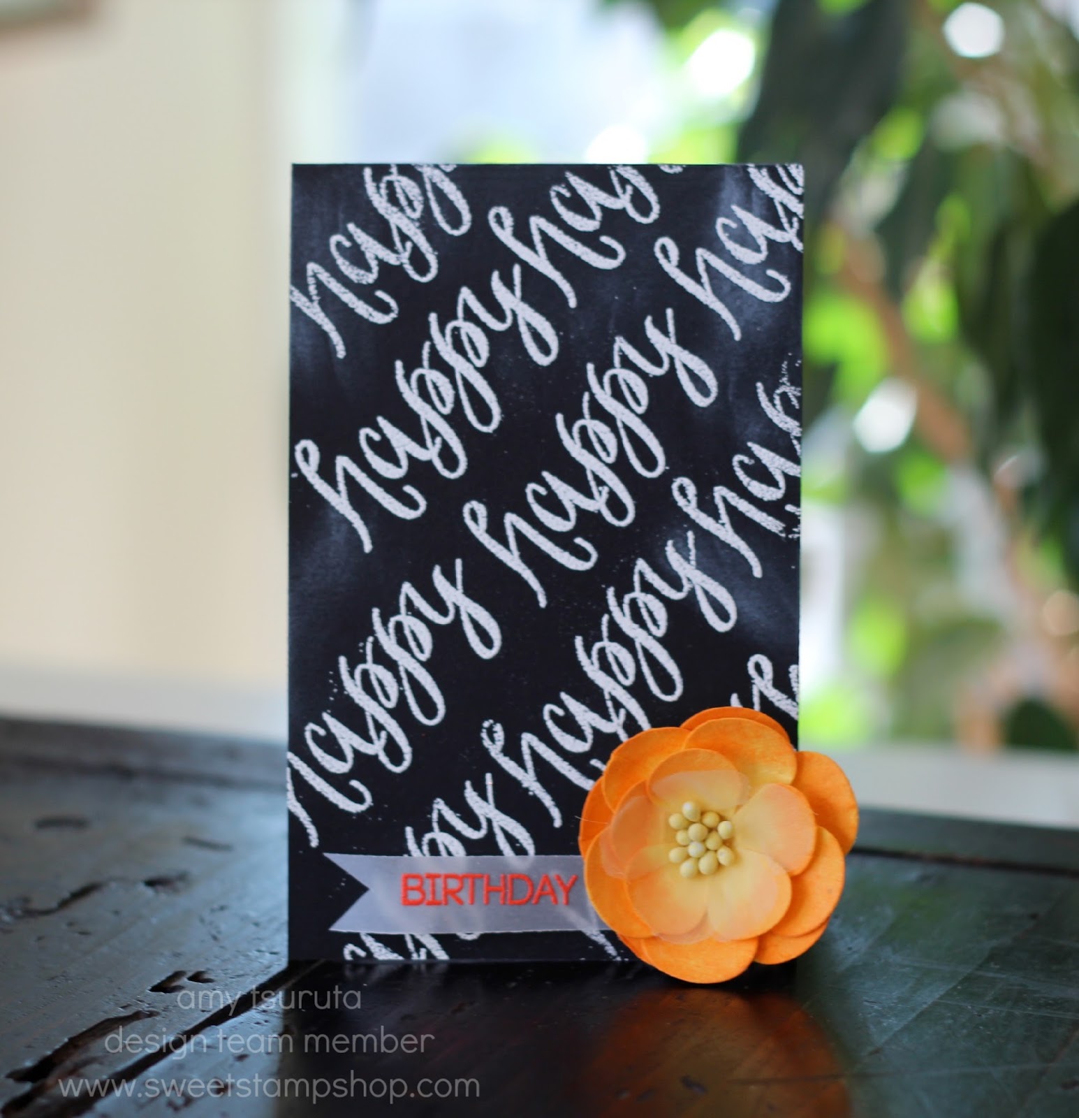
Okay, I should also add that I’m still smitten with the chalkboard look.
I’ve been really enjoying the trend with the dark/black background with the calligraphy text
You get the idea, eh?
I’ve been hoarding my blooms but seriously LOVE the pop of color. Whaddya think? The birthday has been heat embossed with Paper Source’s Picante, my new FAV.
Up next is one that I’m especially pleased with:
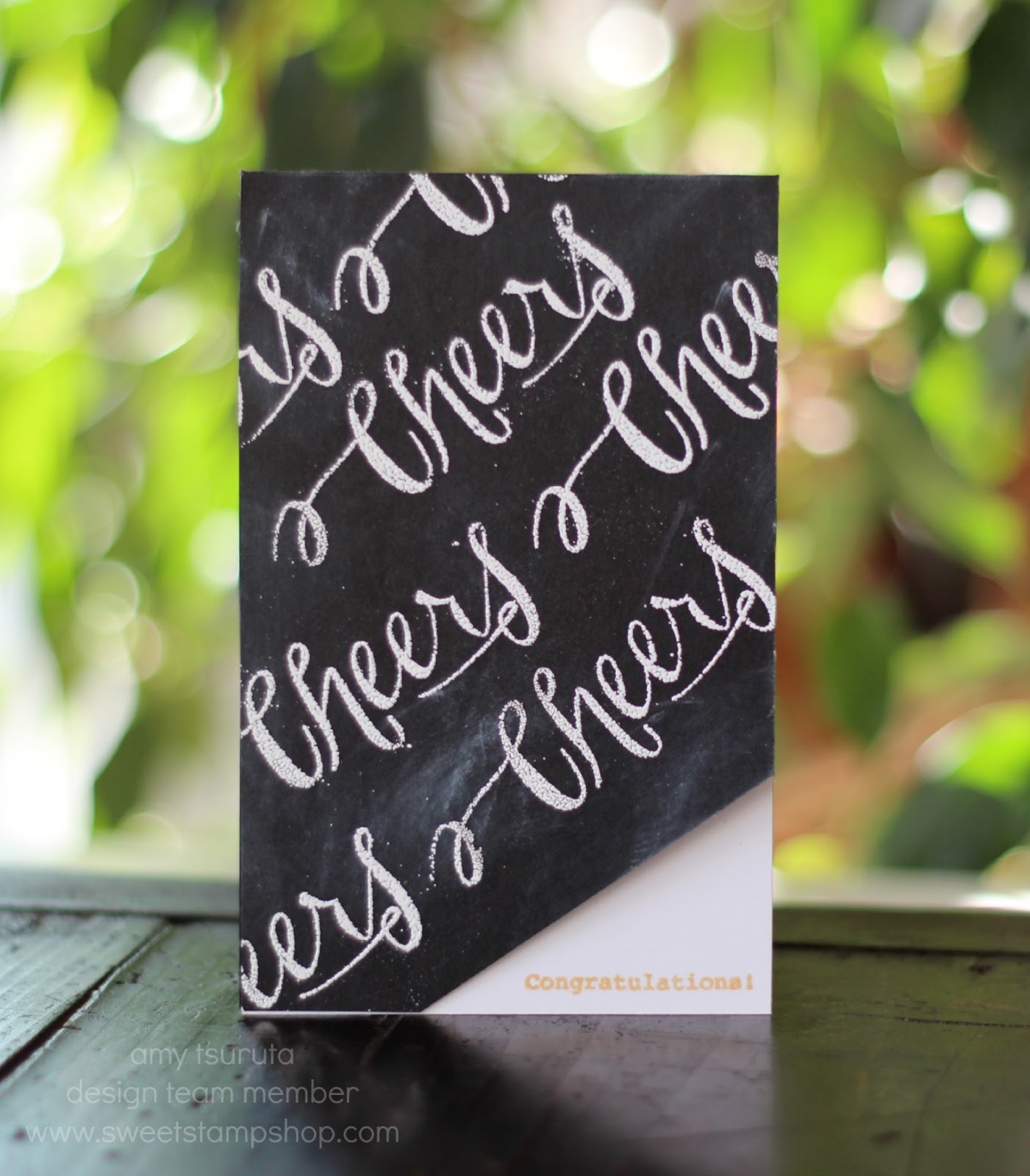
This is going to a former co-worker of mine that finally popped the question to his long time girl friend and he is now happily engaged.
I’ve got to get some massive bonus points for designing a male engagement card!
The congratulations is from the Sweet Stamp Shop’s Easily Distracted set. Since the font is so petite, rather than heat embossing it (it would likely become not-so-readable), I decided to stamp it with Gold Delicata. That stuff rocks.
There you have it….2 cards – 2 ways
feminine vs. masculine.
FEEDBACK PLEASE: What do you think of this font size? Too Small? Just Right? I generally use the ginormous font for my aging eyes but am thinking of changing it up!
Thanks so much for stoppin’ by!
Please follow and like us:
21 thoughts on “Sweet Stamp Shop: bold & elegant”
Feminine vs. masculine perfection. Love this Amy.
Loving those bold chalkboard backgrounds and that flower on the first just pops!
I think the fonts are just right!! I just loveeeeeeeee them both!!!!
These are fabulous, Amy! Love the pop of orange on the first card by using a flower!
FANTASTIC cards Amy~both ways!!! I love ginormous~my eyes insist on aging too. 😉
Happy NSD! Love the chalkboard look and the font size is perfect!
Such Neat Cards Amy!! I LOVE the BOLD Designs!! THANKS for sharing and have a FABULOUS WEEKEND!! =)
I never tire of the chalkboard trend. Awesome cards! I liked the slightly bigger font you had, but that's just me and my aging eyes.
so cute.. loving the stamped backgrounds.. fabulous designing..
Super awesome cards, Amy! Perfect stamping, fab designs…and yes HUGE bonus points for making a masculine engagement card!!
Fabulous cards and the font is fine!
beautiful jobs here! love that pop of orange
Fabulous masculine congrats card! The chalkboard, black & white works perfectly!
Such a pretty card! I just love the chalkboard effect!
Oh, wow, these are gorgeous! So, so bold and graphic and really elegant! I love both versions to pieces!
Oh, and the font size seems good to me…even with my aging eyes. 🙂
Beautiful with white embossing sentiments in black 🙂 Love <3
These are fabulous! I love the bold font in black and white, and the splash of brilliant orange is inspired!
Yes, yes, mad props for a male engagement card … it's just perfect, Amy!! I'm good with the smaller font like you have here. I think it's what I use so I'm used to it.
I love these!!
fantastic 🙂
Black, white, the pop of orange – an absolutely wonderful 'his and her' pair! Wow!! Hugs~c
Comments are closed.